Client background
No employer in the Netherlands will deny that Social Security is complex. The Robidus Group software helps employers to bringing the costs down through optimal utilization of statutory regulations and sending on employability. More than 25% of all organizations in NL with minus 500 employees now work together with Robidus.
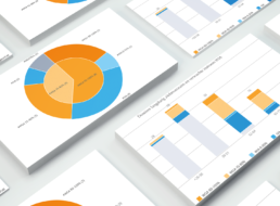
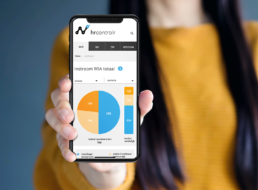
The next step of Robidus was to expand their software with a dashboard where their customers can gain insight into their data regarding insight into the costs, sickness absence and (use of) regulations.
My Role
They asked me to:
- Lay the foundation for this new platform, as an extension to their existing software
- Make the design scalable so that new functionality can easily be added, flexible and user-friendly
- Improve the look & feel
- Making reports easier and automated.
Analyse en research
As soon as an employee becomes ill, a whole range of rules and legislation comes into effect. That’s when the complexity starts…and the headache.
- Learn and listen. First I interviewed and talked to a lot of people, to understand what social security was about and almost got stuck in fuzzy language.
- Target users. As a team it became clear that the audience for the software was not the same as for the platform.
- Needs and pain points. Reporting was mostly a manual process and time-consuming.
- Setting objectives. Moving faster by making smart decisions and make use of data already available.
- Personas. We described the personas and wrote the stories.
- Know your competition. Analysis of the competition to evaluate how the competition is handling usability and what they are focusing on.

fig 1.0
Social security is complex
For employers it is essential to apply the rules in the right way, not to run the risk of fines, but also to avoid losing money. the costs can increase enormously.
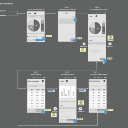
fig 1.0
Research outcome:
the primary goals
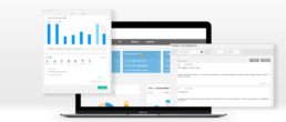
- First of all it should be easy to use, in contrary of the existing software delivering the data.
- It should be accessible to a wider audience. Make reporting fun and easy to use instead of time-consuming and difficult.
- In accordance with the agile approach, we would start of with WIA, adding functionality later on. It proofed to be a good starting point.
- Speed. Delivering reports and benchmarks means data, and nobody want to wait for benchmarks to load slowly.
- The dashboard should contain a knowledgebase, a library constantly updated.
- The dashboard should offer tooling, letting customers ‘play’ with different choices, that lead to outcomes that can save them money.
Prototyping
I did some initial sketching on paper with pencil and sharpies. After some review and iteration, used Axure to create detailled wireframes. The key here was to design, review and iterate until we had a smooth user experience and good performance.
Color Matters
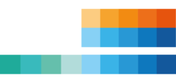
Color can make your data stand out and shine but also can make the data hard to understand and unseemly. Dealing with complex data, the way we would handle the color of the data visualisation was important.
Colour schemes
The graphs have a additional colourpalette. At HRControlr we needed to convey information of several unique data sets in many different types of visualization layouts, a broader range of colours was needed to cover all use cases:
- sequential colourschemes to organize quantitative data from high to low using a gradient effect.
- contrasting colourranges to communicate positive and negative values.